DIVE DEEPER: VISITSAVANNAH.COM

CLEAN, CLASSIC DESIGN
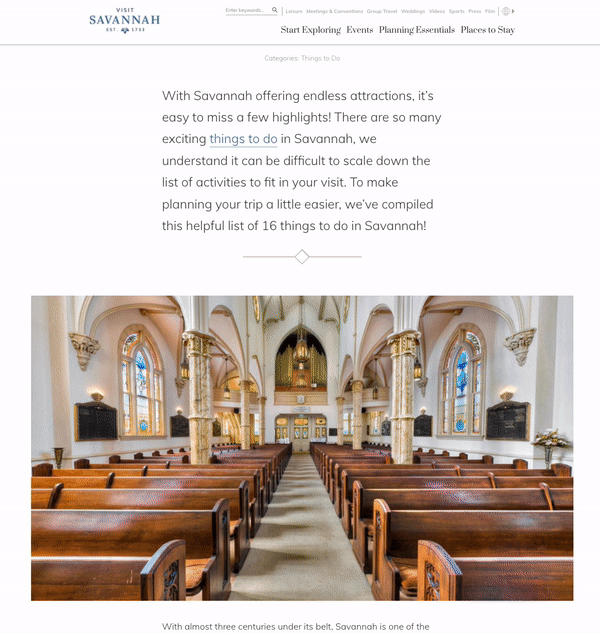
After spending a few days in Savannah with the client team and our web build crew, it was clear that the style of the site needed to reflect the history, the stateliness, the true feeling of the city. It needed to be uncluttered, clean and classic. It needed a color palette that complemented the scenery without detracting from the views. A font set that enhanced the feeling and was easily read, with characters that mimic'd the character found in the destination.
The end result - a website that was a true gallery of design and photography. A place where the user would experience what they felt without having the words to describe it.
IN THE DETAILS

TYPOGRAPHY
Text and number characters were specifically given detailed attention as just like the destination, the devil is in the details.


ICONOGRAPHY
Navigational icons inspired by the client's pineapple logo. It provides the user guidance on the page, used as a focus point for photography and a binding graphical element for site.

COLOR THEORY
A deep-dive into the colors of the destination yielded this palette, perfectly suited to compliment their photography, not overwhelm it.
Even the names of the colors, which are a client-facing feature, were aligned with the destination. The client loved the names I came up with and felt it was a special detail created, just for them.

EDITORIAL LAYOUTS


SUBTLE ANIMATIONS & MICRO INTERACTIONS
List animation design

Share widget animation design

Map reveal animation design
